Coloring for comics these days is usually about knowing color theory and being able to apply it when your handed a 20 pages a weeks later than you expected them. It took me a while to learn what worked for me in order to effectively use my time and get what I had to done. These are some basic things I have learned and hope they help you speed up your processes
1. Setup the Pencil ToolOn your photoshop tool window you can select either the "Pencil" or the "Brush" tool to color in your line art with. The difference between the two is in the edge of the brush. The pencil tool is
Aliased- meaning there's a jagged quality to the edge of your marks. The brush on the other hand has
Anti-Aliased edges-meaning the edges are blurred in order to give a more smooth appearance to your lines.
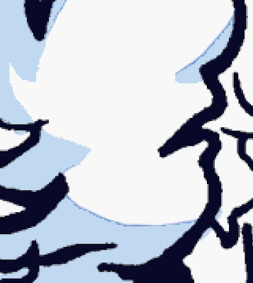
 Alised edge (left) VS Anti-Alised edge (right)The aliased edges of the pencil are made for the selection tools to easily grab around right along its edge. If you select a mark made by a brush tool you're unable to grab the shape right up to its edge, on account of its blurred effect.
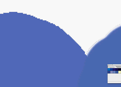 Selection tools grab onto alised edges easily
Why does this matter?
 Shading with Pencil Tool
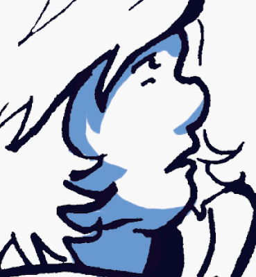 Shading with Brush ToolWell lets say you're shading a face of a character. You've found that the shadow isn't the right shade you want. It needs to be changed. Instead of shading the face again, you select the color shape to change its color on the fly.
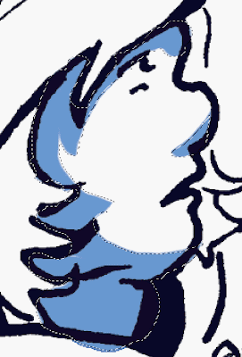 Selecting shapes made with the brush tool
Offset Fill
When you select the shading you made with the brush tool, its offset on account of its soft blurred edges. Therefore when you re fill this shape with a different color you get these off set fill edges of the color you've just tried to get rid of.
By using the pencil tool. you're able to select the entire shape without it being off set. Then select and fill it with no problems. Fast and easy.
 Selecting shapes made with Pencil Tool
 A clean fill!I know the lack of liquid smooth edges that you loose by using the pencil tool is a concerned for a lot of artist going for a specific look. But you know what? When you aren't zoomed all the way in and actually view and image at the PRINT size. Aliased lines look pretty defined. They save you a lot of time. After a piece is finished you can go back and blur things out again with a filter.Before you continue using the pencil tool while doing a page, you have to make sure your eraser and selection tools are also aliased. Its a simple as just un-checking a box up at the top of the screen labeled "Anti-alias"when you have the magic wand/ eraser selected
.
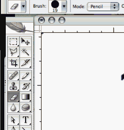 Switching your Eraser tool to "Pencil" Mode will give you an aliased edge. This is located up at the top right next to the "brush size selection"
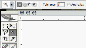
Selection tools can be made aliased by un-checking the box at the top of the screen next to your tolerance setting.
2.
Extra selection tips:-Contigous/ Tolerance: When using the "Magic Wand" tool there are several options and settings that are good to be aware of.
Tolerance is the sensitivity of your selection tool. If you have two colors that are very close to one another in hue/ value, the wand may not recognize these as separate fields of color at first. You can change how "picky" the magic wand is by lowering the tolerance. The lower the number, the more the tool will differentiate between the minute details in your colors.
Contiguous is a command that sets your Magic Wand Tool to select just one shape at a time. If this box is unchecked, the Wand will pick up ALL shapes of the same value (based on your tolerance setting). This makes selecting whole groups and changing them much quicker. Otherwise you'd have to go though and select all similar colors by hand one at a time.
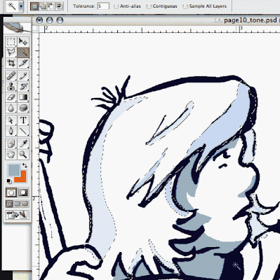 With Contiguous unchecked you can select multiple shapes with the same color value all at once. Contiguous is located next to your Anti-Alias option and tolerance setting at the top of the screen when you have your "Magic Wand" selected3. Know Hot Keys
Hot keys are key board commands that do an action automatically without having to navigate a to a separate menu or click away from a tool you're currently using.
Normally to fill in a selection you would use the paint bucket tool. But why waste the time? By pressing the key stroke: ALT/OPTION and DELETE key your shape will automatically fill with whatever your top swatch is.
The key stroke: APPLE and DELETE fills the shape with bottom swatch
While using your brush tool you can automatically flip between your eye dropper and back again simply by striking the ALT/OPTION key. This enables you to switch your colors quickly without bothering with swatches or having to go back to your tool window.
4.
Pick a Palette.Picking those exact colors to use for a page can be a great time waster. This is something for the most part just gets easier and easier to do over time. As selecting colors depends on your own personal taste and aesthetics. As well as the style of the piece you may happen to be working on.
HOWEVER- It is important to stick to a palette of limited colors to keep a page consistent. Inspiration for palettes can come from a variety of sources. Look at nature. Observe. Ask yourself...if i was to recreate the color that road/ apple / street lamp. what would I mix together? Keep and download images of pages and colors you think are successful.
http://www.colourlovers.com/Color Lovers is a online community of people who are interested in color theory. There are millions of palettes and swatches posted by users. If you're stuck- its a good place to go.
5. Rinse. Repeat.Speed ultimately comes down to practice- just like anything else. The more you practice you're own methods the more you get down your process to a science.
Keep your layers down to as few as possible. Nothing is a bigger waste of time than trying to find that ONE layer you put that ONE skin tone on.
Keep your eyes open to learn what others are doing and try to apply it to your own working methods. Half of the things I've shared are things I learned from other colorist. If you can pick up one tip or trick to make your own process go smoother its worth sitting through a live stream or breezing though a tutorial on deviant art.
Happy Coloring!
-Affe


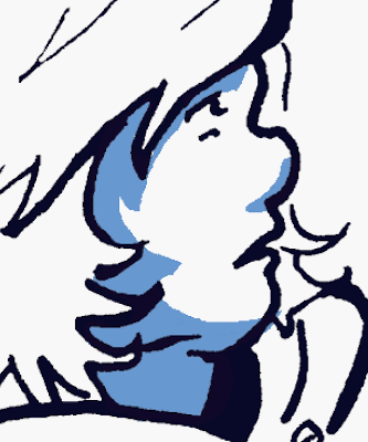
 Dang, keeping up with the internet and doing comics stuff gets kinda crazy sometimes. Here's a breakdown:


