Sunday, August 1, 2010

Alive, and a book exists!

Dang, keeping up with the internet and doing comics stuff gets kinda crazy sometimes. Here's a breakdown:

1. The book is done and exists! It premiered at San Diego Comic-Con a week-and-a-half-ish ago. The nice folks at SLG set Joe, Lauren and I up each day with a spot at the SLG booth for a few hours. Each day passers-by could take a peek through A Friendly Game, talk with us, and pick up a book signed by all three of us if they wished. Thanks again to everyone who stopped by, and to SLG for being so rad to us newcomers!

2. It looks like A Friendly Game has been taken off the pre-order list on Amazon, so you can order it now from there as well! Not sure on the status of other online and physical stores, but we did get a nice compliment from a fellow in Canada who has it in stock and enjoyed it...Whether it's in stock everywhere will probably change in the next week or so.

3. We were interviewed by Tim O'Shea from Comic Book Resources for his column Talking Comics with Tim. You can read the article over here.

That's the quick rap-up. Again, thanks to everyone who stopped by to look at and get a copy of A Friendly Game at San Diego, and to SLG for having us there!

Saturday, February 27, 2010


and then there was a movie...

just cus i'm tired, i will say... watch whip it. dont watch valentine's day and karate kid is still awesome.

whip it is a total "girl power" raise of the underdog with a secret from her parents to follow her dreams" type of movie. it does every turn expected and and the characters are as generic and flat as you could get. HOWEVER. as a director, i was quite surprised by Drew Barrymore's perception of the script and the performances, all-around are quite cute. YET i do not say this with negativity, rather quite the contrary. ITS A MOVIE ABOUT ROLLER DURBY GIRLS. it's just fun. if the movie doesnt strike an interest within the first minutes, it is most likely that it will be a bland experience. BUT if given the opportunity... it's a very enjoyable flick. AND of course.. because it's my scratching comfort...
the soundtrack is really good.

Thursday, February 18, 2010

Printing Blue-lines (or red, if they need be)

Long overdue, it's time to reveal the secrets of printing out pencils in blue lines to ink on real live papers. Here's what I'm workin' with here:
  • 400 lb Vellum Strathmore brand Bristol Board. I enjoy the texture of Vellum, but you can print on Smooth if it's more your thing. I usually buy a lot of it when Dick Blick has a reduced-shipping sale for around $10 a pad or less (11 x 14 size).
  • HP 9800 large format printer: This fellow was over $300 when I first invested in him a few years ago and getting this particular one is probably much cheaper now. I'm not sure what the latest model number is. This guy can be really fickle about grabbing the paper, and you will have occasions of yelling. I believe they can print up to 13 x 19 inches in size. Friendly Game ink pages are at 10 x 15.
  • Adobe Photoshop CS2 for Windows: Not sure if the settings I'm using have gotten moved around in CS3 or CS4, or if they are different in prior versions. You probably will be able to find them based on the screenshots
  • The pencils that I'm working with are scanned at 300 resolution and saved as TIFs. You don't want to go below that resolution, or you'll get pixely printouts that will make you go cross-eyed.
  • I couldn't shrink these screenshots too much without loosing Photoshop button readability, so they will be a bit on the large size when you click on them.
  • Since I'm printing this page, I'm using CMYK colors in the color picker. Ignore the RGBs.
Here we go!
1. First step is to open up Photoshop and grab your penciled scan. Depending on your computer's memory, the size may slow it down. Cropping in close to the border will slice the size down a bit and help it print faster. I usually only blue-line and print one page at a time to be safe. You'll need your image mode to be Grayscale for the next step.


2. At the top, go Image > Mode > Duotone (or Grayscale if you need to first). The Duotone menu will pop up, and clicking on the square of color will open the color picker. A lot of artist have different settings to get the light blue(Cyan), and you may have to try a few settings depending on how bright your monitor is. Mine's like the sun, so mine looks pretty light but will print darker.


3. A curveball here: I'm printing this particular page in red. The reason being is that if you're using a tri-color cartridge like the 9800 has, you will eventually suck down that one color. To have it last longer, I switched between Magenta-heavy colors instead of Cyan. If you can find a large format printer that has individual cartridges instead of tri-color, go for it. You can also save these color settings for later from the Duotone Options box, which is a great timesaver.


4. From the top, File > Print Preview. Your page will not fit, but that's fine because we're getting ready to tell the computer all about the size and printer. From here, click Page Setup.


5. By default, your printer will probably be at Portrait, but check to be sure. Choose Printer, then select the HP9800 from the dropdown if it's not your default. Next, click Properties.


6. Under the tab Paper/Quality, you can set the printer to take the large-format size. 10x15 size is close to Tabloid, and you'll want Other Brochure Paper, since that's a thicker paper type. You can also save your settings for this screen as well like I have (Comic Page). Click Okay.


7. Now the screen will look more like it's supposed to when it's printed. Hit the print button, and stay close by to watch that the paper is grabbed correctly from the tray.


Sometimes the page prints fast, and sometimes it'll take 20 minutes. Again, this will depend on your computer and if the printer likes you. (No, really.) The computer and printer I used for printed Friendly Game pages usually enjoyed thinking about printing for 10 to 15 minutes, then spit the page out in about 3 minutes afterward.

Additionally, I've found inking over a page printed with red ink is sometimes a little more strain on the eye as opposed to the blue. It's all about what works best for you when inking the page and will let you use as much of the ink from that wee printer cartridge as possible.

Tuesday, February 9, 2010


so, the lettering and the toning are going better than assumed and we're looking at a good schedule to finally have this book finished, however, i'd like to talk about something i've been observing. working on films as a storyboard artist, i've noticed a few key differences in the language and i think it has to do with with the... facts that comics are drawings, films are real people. i know that sounds dumb and obvious, but it is the predominant difference.
the simplicity makes the difference. live-action films tend to be straight-on shots, as oppose to comics, where it's insisted that shot compositions are designed with dynamism.
in terms of shot-labeling, 3/4 profiles, medium shots, medium close-ups and so on, are not the same in one medium as they are in the other. live actions tends to be more distant, where in comics, medium shots are closer in to characters. even if the drawings are realistic or cartoony
...it's funny how it makes a difference...

Saturday, February 6, 2010


lettering: full speed/engaged-all systems-GO! operative 5.37xv-post-206---
toning: readings-reveal/top-secrete alt+0.4= crank-up the awesome knobs and switch-a:^_^
oxygen:atfullcapacityandeverythingseemstogoaccordingtoplan.

let the wOrK be done.

Tuesday, January 26, 2010

Speed coloring Basics. Tips for getting it done

Coloring for comics these days is usually about knowing color theory and being able to apply it when your handed a 20 pages a weeks later than you expected them. It took me a while to learn what worked for me in order to effectively use my time and get what I had to done. These are some basic things I have learned and hope they help you speed up your processes


1. Setup the Pencil Tool

On your photoshop tool window you can select either the "Pencil" or the "Brush" tool to color in your line art with. The difference between the two is in the edge of the brush. The pencil tool is Aliased- meaning there's a jagged quality to the edge of your marks. The brush on the other hand has Anti-Aliased edges-meaning the edges are blurred in order to give a more smooth appearance to your lines.


Alised edge (left) VS Anti-Alised edge (right)


The aliased edges of the pencil are made for the selection tools to easily grab around right along its edge. If you select a mark made by a brush tool you're unable to grab the shape right up to its edge, on account of its blurred effect.


Selection tools grab onto alised edges easily

Why does this matter?


Shading with Pencil Tool


Shading with Brush Tool

Well lets say you're shading a face of a character. You've found that the shadow isn't the right shade you want. It needs to be changed. Instead of shading the face again, you select the color shape to change its color on the fly.


Selecting shapes made with the brush tool


Offset Fill


When you select the shading you made with the brush tool, its offset on account of its soft blurred edges. Therefore when you re fill this shape with a different color you get these off set fill edges of the color you've just tried to get rid of.
By using the pencil tool. you're able to select the entire shape without it being off set. Then select and fill it with no problems. Fast and easy.


Selecting shapes made with Pencil Tool


A clean fill!


I know the lack of liquid smooth edges that you loose by using the pencil tool is a concerned for a lot of artist going for a specific look. But you know what? When you aren't zoomed all the way in and actually view and image at the PRINT size. Aliased lines look pretty defined. They save you a lot of time. After a piece is finished you can go back and blur things out again with a filter.

Before you continue using the pencil tool while doing a page, you have to make sure your eraser and selection tools are also aliased. Its a simple as just un-checking a box up at the top of the screen labeled "Anti-alias"when you have the magic wand/ eraser selected.


Switching your Eraser tool to "Pencil" Mode will give you an aliased edge. This is located up at the top right next to the "brush size selection"


Selection tools can be made aliased by un-checking the box at the top of the screen next to your tolerance setting.


2. Extra selection tips:-Contigous/ Tolerance:
When using the "Magic Wand" tool there are several options and settings that are good to be aware of.

Tolerance is the sensitivity of your selection tool. If you have two colors that are very close to one another in hue/ value, the wand may not recognize these as separate fields of color at first. You can change how "picky" the magic wand is by lowering the tolerance. The lower the number, the more the tool will differentiate between the minute details in your colors.

Contiguous is a command that sets your Magic Wand Tool to select just one shape at a time. If this box is unchecked, the Wand will pick up ALL shapes of the same value (based on your tolerance setting). This makes selecting whole groups and changing them much quicker. Otherwise you'd have to go though and select all similar colors by hand one at a time.


With Contiguous unchecked you can select multiple shapes with the same color value all at once. Contiguous is located next to your Anti-Alias option and tolerance setting at the top of the screen when you have your "Magic Wand" selected


3. Know Hot Keys

Hot keys are key board commands that do an action automatically without having to navigate a to a separate menu or click away from a tool you're currently using.

Normally to fill in a selection you would use the paint bucket tool. But why waste the time? By pressing the key stroke: ALT/OPTION and DELETE key your shape will automatically fill with whatever your top swatch is.
The key stroke: APPLE and DELETE fills the shape with bottom swatch

While using your brush tool you can automatically flip between your eye dropper and back again simply by striking the ALT/OPTION key. This enables you to switch your colors quickly without bothering with swatches or having to go back to your tool window.


4. Pick a Palette.

Picking those exact colors to use for a page can be a great time waster. This is something for the most part just gets easier and easier to do over time. As selecting colors depends on your own personal taste and aesthetics. As well as the style of the piece you may happen to be working on.

HOWEVER- It is important to stick to a palette of limited colors to keep a page consistent. Inspiration for palettes can come from a variety of sources. Look at nature. Observe. Ask yourself...if i was to recreate the color that road/ apple / street lamp. what would I mix together? Keep and download images of pages and colors you think are successful.

http://www.colourlovers.com/

Color Lovers is a online community of people who are interested in color theory. There are millions of palettes and swatches posted by users. If you're stuck- its a good place to go.


5. Rinse. Repeat.

Speed ultimately comes down to practice- just like anything else. The more you practice you're own methods the more you get down your process to a science.
Keep your layers down to as few as possible. Nothing is a bigger waste of time than trying to find that ONE layer you put that ONE skin tone on.

Keep your eyes open to learn what others are doing and try to apply it to your own working methods. Half of the things I've shared are things I learned from other colorist. If you can pick up one tip or trick to make your own process go smoother its worth sitting through a live stream or breezing though a tutorial on deviant art.

Happy Coloring!

-Affe

Sunday, January 17, 2010


i want to thank Dan Vado for the ery informative conversation we had last thursday. now Lindsay, lauren and I are picking up
the pace and finishing things as fast as we can. lauren has been doing a great job at toning. and lindsay, as always, the ever responsible has just finished what we hope to ve the final cover fo the book we've been working on for so long. i on the other hand occupy my time with freelance work, personal projects and... at some point, a personal life.
in the mean time. i will simply say that it is late, i am tired and i am glad to be working with such a team.
just becuase there;s booze int he ssystem i will say a big shout out to the periscope studio, the entire norris hall and those who have been supportive and hopeful to our
project.
its been a long road, and it seems surreal to be at this point.
thaks again...

everyone...

Saturday, January 16, 2010

Paper beats Screen or Screen beats Paper?


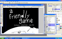
That cover Joe mentions is a major win. Lauren will make it a 15 out of 10 because of her awesomeness. Stick with me on this post, since it's gonna be a bit of a doozy. I'll throw in some screenshots to ease the talkies.

While it's fresh on my mind, it's time to address an issue that's been creeping into comics over the past few years: traditional methods or computers for drawing.

To keep things in perspective, this article is focusing on the aspect of inking comic pages or illustrations with pen and ink on paper in comparison to inking with a computer. I'm not touching the hand-painted, computer colored issue or drawing something straight out of your head onto either paper or into a computer file. This stuff's for inkers.

The total page count for Friendly Game goes past 200 when you count the unused pages and promo work, and as they are pages that have all been inked on 10 x 15 bristol with a series 7 sable brush or some form of nib, they are the epitome of traditional inking methods. With the exception of laziness regarding inking panel borders on every page (I gave up somewhere around the 115th page when my lines didn't look straight enough and vowed to use Photoshop on the rest), I've gone through bottles of ink, stacks of Bristol pads, probably a pound of those crappy 102 nibs and countless paper towels for cleanup. This is what I'm used to, this is what I've learned at SCAD, this is a comfortable inking system for me.

Around 7 or 8 months ago, my then-fiancee and I had stumbled upon a student-discounted edition of 
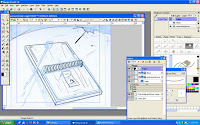
Manga Studio EX. James does a webcomic and had been getting frustrated drawing his comic on bristol, inking, scanning, and cleaning up his traditional linework for something that was published online. After we bought Manga Studio, we were introduced to a computer program that is actually tailored toward black and white comic art. While there are plenty of methods to drawing and inking comics in Photoshop, Manga Studio had numerous features that sped up James's comic production greatly and cut out a lot of extra work the traditional methods created for him and his webcomic work.

I used Manga Studio for inking some of my pages for my comic projects during my last quarter at SCAD and found that my confidence level in inking my own work was much greater than when I inked traditionally. This is super beneficial since my next project after Friendly Game is also a webcomic.

Backstory aside, here's an overall pros and cons breakdown of traditional and computer inking:
Finacial - Both James and I were fortunate enough to receive a Cintiq as a wedding present. For those unfamiliar, drawing comics with a Cintiq is even faster than using the Wacom tablet as the Cintiq mirrors your computer's screen. This removes the awkward eye-hand co-ordination issues that pose a hurdle when one first learns to draw on the computer with a tablet.

However, they don't come cheap (hence, putting it on a wedding regstry instead of tupperware). In the matter of traditional artwork, sequential artists are much better off than oil painters or sculptors in that our usual supplies aren't that expensive.

A quick search of Dick Blick art supplies tells me I can get a series #7 sable brush size 3 for under 20 bucks right now. Considering how small a brush is, that is still a little expensive, but when you add the pad of 400 series bristol for another 11 bucks (or less or more, depending on your size) and some ink for around 4 bucks, it's a lot more affordable than the Cintiq. The additional traditional inking elements such as rulers, specialty brushes, white out also vary in price but are generally affordable and don't need replaces as often as the ink-brush-nib-paper combo. My bristol alone isn't even half of what the Cintiq is. Throw in the usually price for Manga Studio or Photoshop and the price tag's even greater. On this subject, traditional wins.

Availability - So say you have the possibility of inking something either traditionally or digitally. You go traditional. You're rocking along, jamming out pages, and are out of ink. Like, literally, none in the house, and you no longer live nearby crazy art friends that you can bum off of. It's midnight, you need this done now, and obviously online shopping isn't at the point where it spits the product out after you've ordered it. You're boned.

A situation that extreme has not happened to me, but something similar has happened as far as my tools go. I'm currently in a town where the major art supply comes in the form of the Michael's and Hobby Lobby brand, and those stores seem to center more on fake flowers than selling 3 packs of the really nice Japanese nibs that I got myself addicted to before leaving SCAD. To it's credit, Hobby Lobby actually stocks more variety of art supplies than Michael's, but anyhow....I have had to order online a lot more, and in some instances did not go for the awesomer stuff that I could pick up at the store in Savannah because of the price of ordering it online. I had to be sure that I kept up with how much of which tools I had left and on occasion had to work with dead brushes and nibs and make the most of it.

Digitally, only very severe or extreme situations will block your tools. Power outages are at the top of this, and are completely out of your control. Cintiq's gotta have juice going to it to work. Right after that is computer hardware or software failure, and depending on what happened, you could be set back a few days, a full month, or be turning back to drawing on paper and heading toward Kinkos to scan and send it off. Despite these extreme situations, the your digital inking still wins this one, since it holds all the tools you could possibly have to run out and buy.

Comfort/Feel - This may not be the best word to describe everything for this section, but how about working with brush and nibs and ink compared to a Cintiq and Manga Studio?

The paper I usually use is 400 series Vellum. It has a nice tooth, good thickness and I enjoy the textures that I get from it. This unfortunately doesn't always agree with using nib pens, and I've frequently sworn and chucked ones aside that have managed to catch on the paper too often, despite my carefulness.

Drawing on a Cintiq or tablet is more equivalent to using smooth-grade bristol, which I personally do not enjoy. I feel like my drawing arm is sliding everywhere and that my ink is going to fall off when I use smooth bristol, and that applies the same to the Cintiq. With regular tablets, I have heard of some people who place a sheet of paper over the tablet, which allows the pen to still work and gives the traditional feel of paper. This doesn't work with the Cintiq since what you're drawing appears on the same screen right under your pen.

Additionally, if you're into using your comic pages to completely cut loose when it comes to inking, there's nothing more satisfying than splattering, blotting, or scratching ink all over a piece of bristol. It's therapeutic in the way and gives you the feeling you had when you were small and someone handed you some pencils and paper and said "Have at it, kid." In this regards, tradition is a winner if you're not a fan of smooth paper or if you like the physicality involved in over-the-top inking methods. But if you don't really care either want and just want to ink, than it can go either way. This leads up to a trump card.

Speed - This one is tricky, because this one relies heavily on the inker to determine some parts. When it comes to inking traditionally, mistakes can sometimes be a bitch to fix. Electric erasers and whiteout are awesome, but on occasion, you overshoot it and have to correct your correction. Then, the most controversial matter of inking in comics history: spotting blacks.

I personally hate the little x's that are used for penciling, but I know why they are there. It's a speed thing. The pencils have to be done quick, and giving a suggestion of placing blacks is faster pencil-wise with an x than using your graphite. In both Friendly Game and in his other pencils, Joe does not view the page as complete if the graphite is not in the black-out areas. While inking his pages, this made it easier for me to visualize how those black placements would look on the finished page than the x's, which would lead me to thinking "Yeah, that sounds cool," or "Screw that, I'll spot it like this instead" and tweak it.

A lot of inkers in the industry now may not even use the ink on their actual pages, they wait to fill them with Photoshop. And although I agree with Joe in that the page isn't done without the black placements, I won't deny that it takes longer to black out areas on paper than grabbing that little bucket on the computer and clicking.

Going back to the trouble James had with his webcomic, the time it took to scan and adjust his lines to color it in Photoshop added up. As far as Friendly Game goes, not only was there scanning and adjustments involved, but I didn't ink over Joe's originals, I printed them out. This took time as well, some extra provided by my computer being a screw-up. This is a major point as well, as a computer that is unwilling to notice your tablet or Cintiq as plugged in may result in you have to restart, reinstall, restart, yell s'more, and loose and hour or so, depending on the situation.

When Joe brought up how quick we needed the cover punched out, he mentioned Manga Studio. I have been in a traditional mind-set for Friendly Game's pages and at first wanted to do the cover with paper and ink as well, but the time crunch was evident, so computer inking won. And yes, I punched it out a lot faster since I skipped the steps of printing, scanning, and re-scanning as far as putting it into the computer.

This leads up to the biggest catch with digital inking: The ability to create fast possibilities.

Because the cover was on the computer, and since the computer has that infamous "undo" button, I could play around with different textures, placements, line width, styles...All sorts of things that would take much longer to create traditionally, can happen in an instant. They can also be gone in an instant. Because of that, there's a greater danger of trying to create too many scenarios with your inking that could keep you from getting the job done. And when it comes to deadlines, that is very dangerous.

Extra Cash / Space - This is kind of an extra to consider and is brought up a lot by traditional inkers. Should your comics be created on the computer, you have no original artwork to sell. You can sell prints, but they will not have the same value an original, one-of-a-kind page will carry. Playing devil's adovacate, if you just finished a 200+ page book and only sell some of those pages, you have stacks of physical pages you'll be lugging around whenever you move and then stuff into shelves and closets.

I could probably keep rambling about this, but those are the major points to consider when you're choosing how to ink your comic. It really becomes a case-by-case basis and a matter of personal preferences and knowing your weak spots as an inker. Whether or not you would work out those weakness through traditional inking or digital depends on how much exposure you have and how well you take to either method. Try out everything as much as you can, and go with what works best for you.

well, happy new year internet. tho you dont care about us, we have missed you.
it is a new decade and i think it should be driven like a pogo stick: with both feet int he right direction. this week we got in touch with our editor, Dan Vado, and he was, as always, a dear. letting us know the details to lettering and, pretty much how we have to be working on the cover for this book, like... now...
fortunately, we are succeeding,
as that very day, i penciled it and just last night, lindsay has inked it. now, with the speed of a motherfuking cheetah, we will see lauren take on this image and crank it to 11. maybe 12.
so, for the first time in, like... a while, i'm getting a bit of a cold and i dont li
ke it, specially cus it makes the nose itchy and that's just obnoxious. but, as it normally goes, i will get better soon,a dnin the mean time... back to work.
a wonderful day seems on the rise, so. let's assure it occurs.